Dec 25, 2025

1. Background & Problem Statement
Music streaming is deeply embedded in users’ daily activities—commuting, running, traveling, or relaxing. However, most music apps still assume users are stationary and able to interact with their screens frequently.
Key problems identified:
This project explores how location and motion can enhance music experiences without overwhelming users.
2. Goals & Success Criteria
Primary goals:
Reduce friction before music playback
Enable safe, hands-free interaction during movement
Increase emotional engagement through contextual listening
Improve conversion toward Premium subscription
Success indicators:
Faster time-to-play
Reduced homepage drop-off
Higher engagement with discovery features
Clearer subscription understanding before purchase
3. Discovery & Ideation
Concept Exploration
The name MusicMap immediately suggested a relationship between music and location. I explored map-based applications like Strava, observing how location and movement naturally enhance user experiences.
Both music and maps are commonly used during:
Running
Commuting
Traveling
Relaxation
However, most music apps do not leverage location meaningfully.
4. Key Insight
Users want to enjoy music while moving — not manage it.
Many users:
Cannot constantly touch their phones
Are uncomfortable with physical controls or TWS gestures
Want music to adapt passively to their context
This insight led to the idea of hands-free interaction and context-aware music discovery.
5. Solution Overview
MusicMap introduces two core innovations:
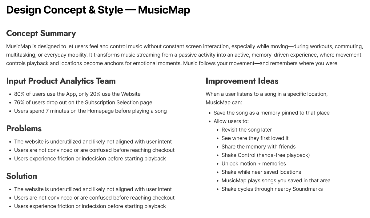
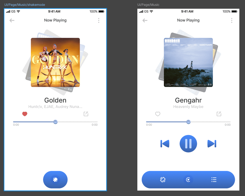
🎵 Hands-Free Interaction
Motion-based gestures (e.g., Shake to Skip)
Designed for smartphones and smartwatches
Enables safe interaction without screen touch
📍 Soundmarks
Songs tied to specific locations and moments
Music becomes part of personal memories
Users can revisit or share these moments
Encourages organic emotional sharing
6. Information Architecture & User Flow
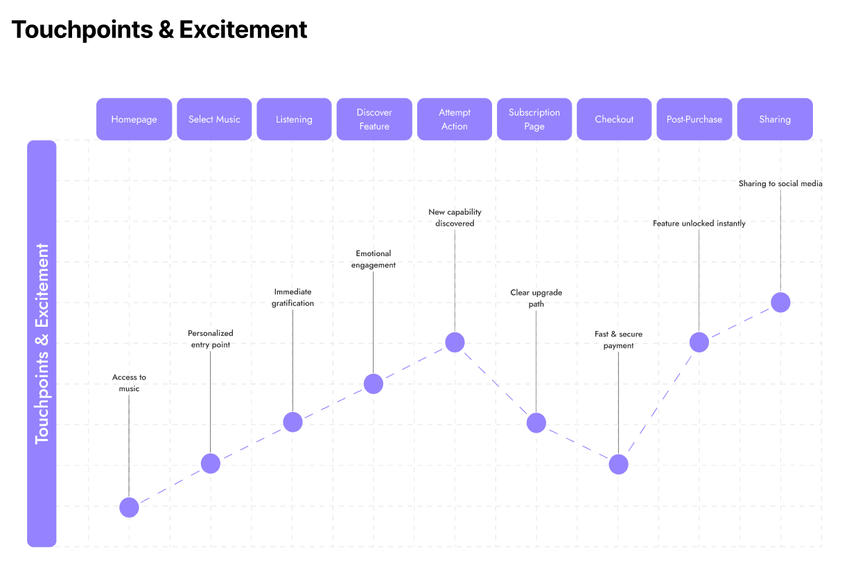
After defining the value proposition, I quickly mapped the user flow to identify:
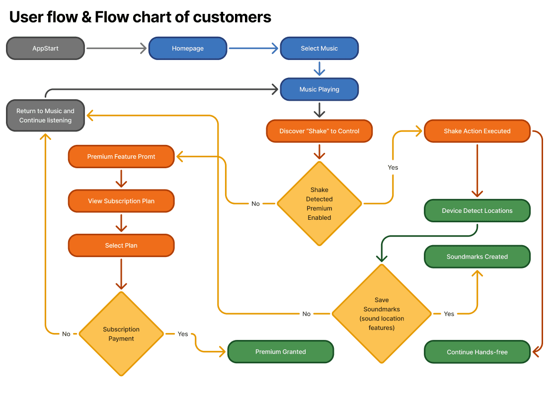
Entry points
Discovery moments
Conversion opportunities
I focused on mobile-first, as it represents the majority of use cases.
7. Reducing Playback Friction
Problem Identified
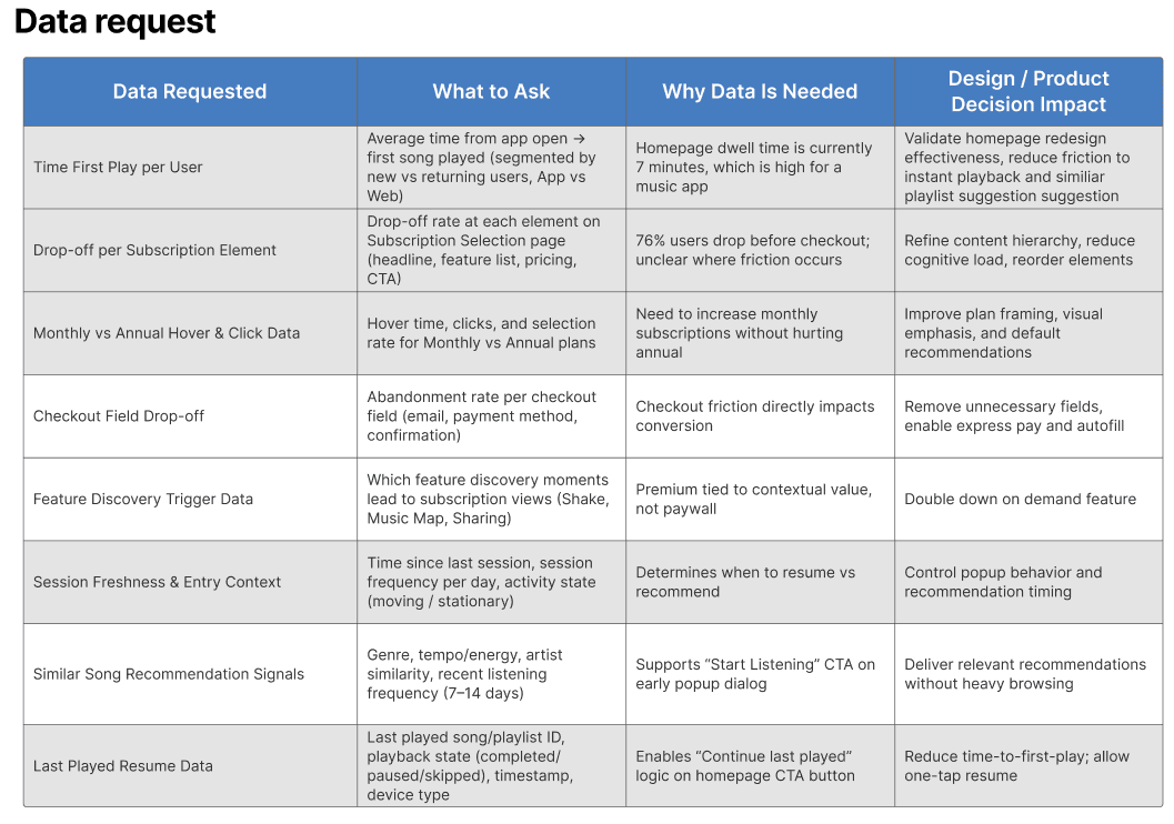
Analytics showed users spend ~7 minutes on the homepage before playing music.
Reasons:
Too many choices
Multiple confirmation steps
Decision fatigue
Design Solution
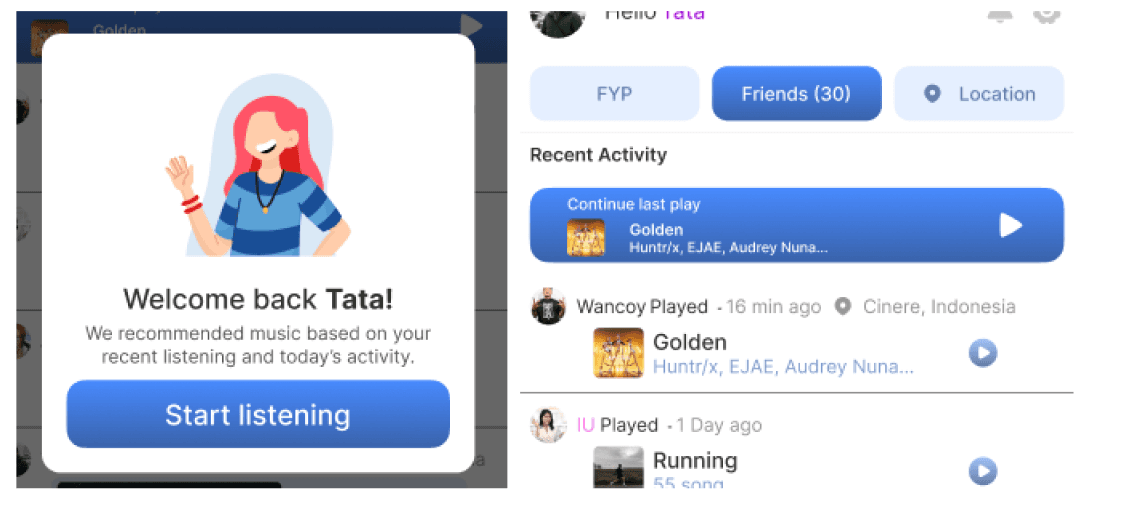
A lightweight daily homepage popup:
Appears on first app open each day
Welcomes users back
Instantly recommends music based on context
Primary CTA: “Play something you’ll like”
Secondary CTA: “Continue last played”
📉 Result: Reduced steps from 4–7 → 1 tap
8. User Journey Mapping
To validate decisions beyond visuals, I created a user journey map focusing on:
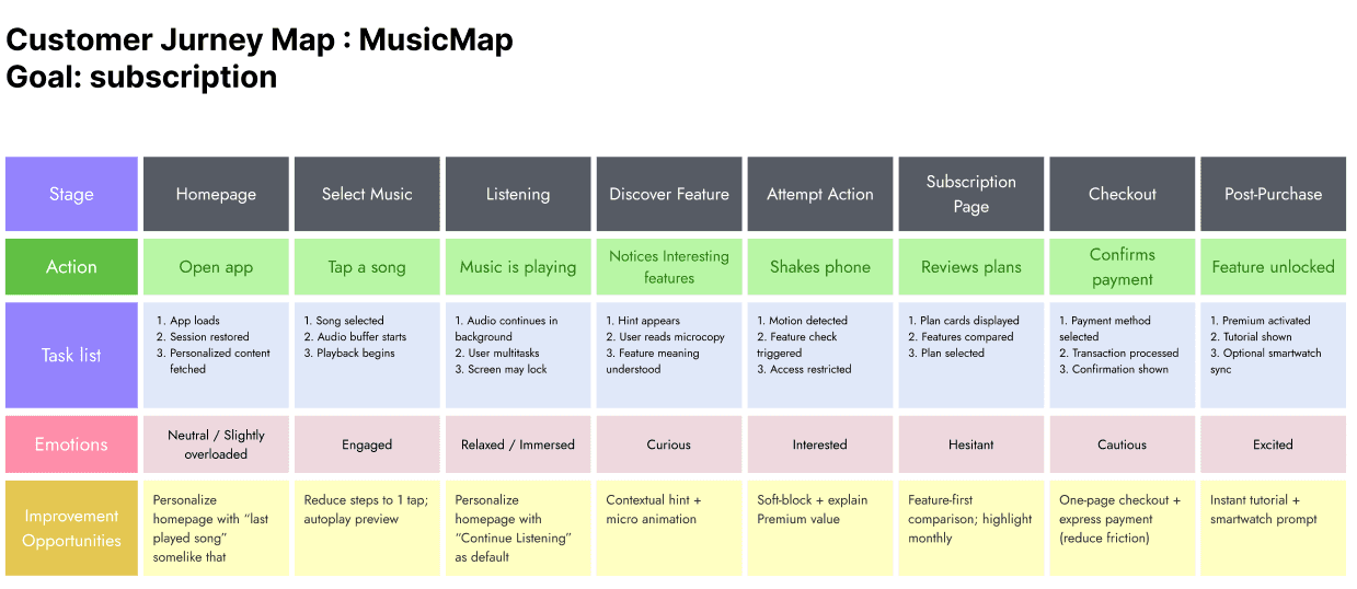
User actions
Emotional states
Expectations
This ensured the experience remained empathetic, especially during on-the-go usage.
9. Design Execution Strategy
Constraints
Solo designer
2-day timeline
Approach
Instead of starting with a full design system:
Designed high-fidelity screens first
Validated core experience
Broke screens down into reusable components afterward
10. Design System & Components
Challenges
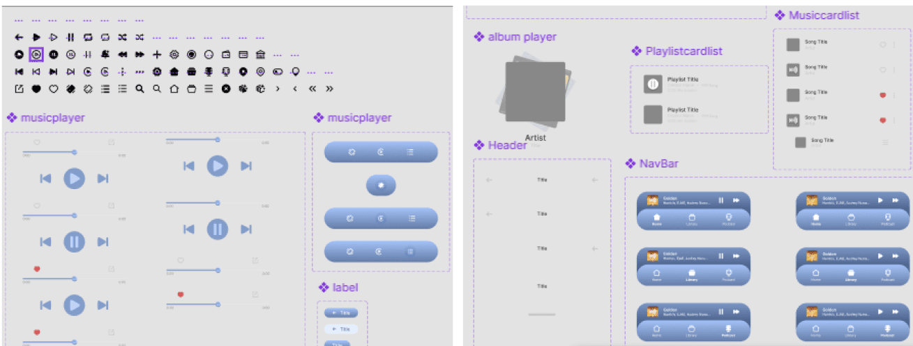
Token naming initially inconsistent
Container hierarchy needed refinement
Improvements
Reorganized auto-layout structure
Improved component naming for scalability
Built reusable components for mobile & desktop
Ensured icon consistency across platforms
11. Accessibility & Theming
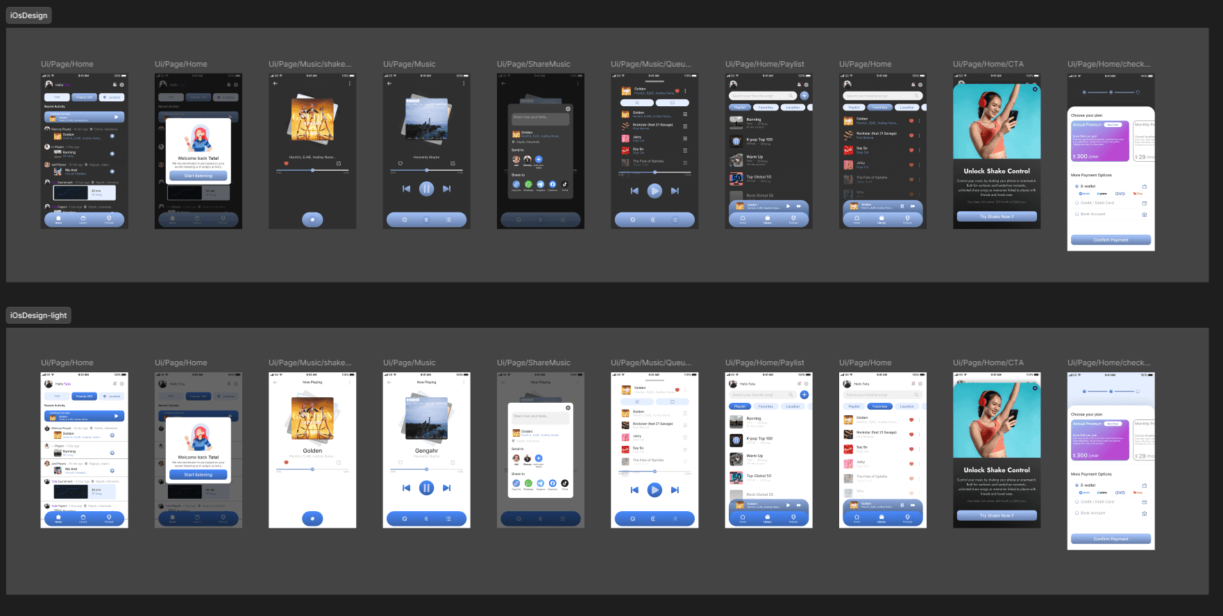
To support high-mobility usage:
Implemented Light & Dark Mode
Improved contrast and readability
Ensured visual consistency across themes
12. Subscription Flow Optimization
Subscription flows often introduce friction similar to KYC processes.
Improvements made:
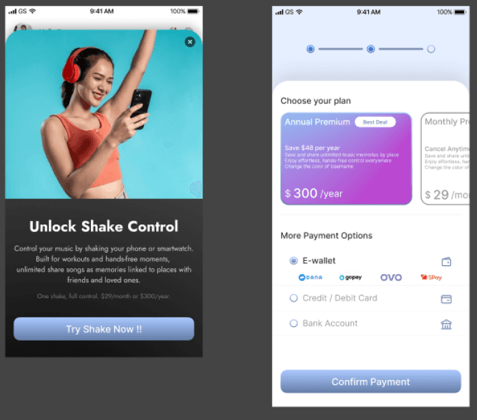
Reviewed metadata needs per screen
Clarified Premium activation messaging
Simplified pop-up and confirmation flow
Ensured users understand Premium activates immediately after confirmation
Result: Cleaner, more confident conversion experience.
13. Technical Feasibility & Collaboration
All features were designed with current technical capabilities in mind:
Motion gestures use standard accelerometer APIs
Location-based Soundmarks rely on existing geolocation services
Lightweight metadata structure ensures performance
Modular UI supports responsive web & mobile
Design tokens enable easy theming and scalability
This ensured smooth collaboration with engineering and minimal implementation risk.
14. Outcome & Learnings
What worked well:
Faster time-to-play
Reduced cognitive load
Strong emotional engagement via Soundmarks
Clearer subscription journey
Key learning:
Designing for context, movement, and emotion creates stronger product differentiation than purely visual enhancements.
